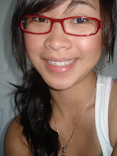
Wednesday, June 10, 2009

Image Book Process


I decided to make a folder and little cards for my image book project. This was my original folder but i created the folder too big thinking giving it extra room would be best but it made it look ugly. I created a belly band for it but it was too small and did not fit around the folder.


Front and Back of my second folder. This time i measured it just enough for the cards to fit. I don't know why the color printed out different but i like this color a little better. I also made another belly band and LOVED how it looked around the folder. =] I also added a title to it after seeing all the other books in class. I like my final piece the only thing i regret is using a x-acto knife to cut my cards.... I SHOULD OF USED A CUTTING BOARD!! but i kind of feel weird standing there at kincos cutting my cards. I was taking my time and than this lady was standing in line to use it. I didnt want to be rude and stand there all day so i went home. Learned my lesson with cutting paper..... I wish it was PERFECT!

Week 10 Tutorial

1. Creating Tape
http://tutvid.com/tutorials/photoshop/tutorials/tapedEdges.php


The tape look so real! I liked this tutorial, thought it was easy to follow the guys did a good job explaining. it looks so real! The new tools i learned in this tutorial is the layer styles and blending modes you can use to change the effect which made the tape. I learned that you can fill the dotted rectangles. cool stuff!

2. Virtual Weight Lost
http://www.youtube.com/watch?v=hsiQptl_Y9E&NR=1

This tutorial was kind of funny. The guy made some pretty harsh comments but its okay. I got learn a few new tools. The liquify tool, healing brush, spot healing, clone and patch.

3. Create a Sleek illustration that Fades from Line Art to Color
http://psd.tutsplus.com/tutorials/photo-effects-tutorials/create-a-sleek-illustration-that-fades-from-line-art-to-color/

I thought this was really creative! the pen tool does wonders. Layers are so important as well. I thought this tutorial was pretty easy to follow. they included a video tutorial with the step by step image tutorial. thats a PLUS!

4. Illustrate a Delicious Ice Cream Bar
http://psd.tutsplus.com/tutorials/drawing/how-to-illustrate-a-delicious-ice-cream-bar/

what caught my attention on this one was the lines on the ice cream bar. The ice cream bar is super precise and looks flawless so i wanted to check it out. I liked how this tutorial was a little bit more detailed when explaining the steps. There was one thing that seemed like it could of been done an easier way.
"grab the Move Tool and while holding down the Alt key press the Right Arrow key 89 times, until you reach "Bar copy 89" in the layers palette."
Really? thats crazyyy. I guess that just shows that there is more than one way to do something. && there is a lot of steps in this tutorial. Only for an ice cream bar. pretty cool details though.

5. Useful Applications for the Clone Stamp Tool
http://psd.tutsplus.com/tutorials/tools-tips/useful-applications-for-the-clone-stamp-tool/

They were able to straighten the leaning tower of pisa that was awesome! Oh i love the clone tool. it is so fun to use. I never thought it did this kind of stuff. I only used it for simple things before and already thought it was cool but now this is even better. Cool tutorial! It did example on more than one object. i enjoyed the tower one the most.

Thursday, May 21, 2009

Week 9 Tutuorials

1. Craft a Dramatic Vector Landscape Environment
http://vector.tutsplus.com/tutorials/illustration/craft-a-dramatic-vector-landscape-environment/


This one really frustrated me! I was only doing the grass and illustrator wouldn't do what i wanted. I wanted to have it gradient and green at the same time and it would only let me choose one. I couldn't find a way to do it and it drove me nuts. This is the type of thing that makes me want to pull all my hair out. So than I had to ask someone! so the trick was drag and drop the color in. OMG. well that part took forever... moving on.

here i added the sky, stars and the moon. The complete sky scene is complete! After the grass everything else becomes is a piece of cake! The stars are so pretty =]

2. Learn a Professional Workflow for illustrating a Comic Style Header Image

http://vector.tutsplus.com/tutorials/web-design/learn-a-professional-workflow-for-illustrating-a-comic-style-header-image/

Watching professional do their work is always fun! They always tend to go so fast though... I hope someday i can do this as fast as they can. BUT than again... its probably just the video that makes it seem so fast.

3.Tips for working with the Gradient Mesh Tool in illustrator
http://vector.tutsplus.com/tutorials/illustration/tips-for-working-with-the-gradient-mesh-tool-in-illustrator/

I just had a feeling this would come in handy someday. if you place the shadow at the right place, it makes the image more realistic because it has shadow. Although the tutorial said tips.. but it did not have tips. It went through a few short steps of how to make the color flow. It was not a really helpful tutorial.

4. Design a Classic Heraldic Figure
http://vector.tutsplus.com/tutorials/designing/how-to-design-a-classic-heraldic-figure/

I like this design but the tutorial sucked. It was not detailed so i could not follow along. I did like how they used a little drawing and connect it to create this design. They also made this design in all black which looked a little bit plain.
5. Removing Glasses
http://www.tutvid.com/tutorials/photoshop/tutorials/removeGlasses.php

OMG the healing tool is amazing! The little band aid icon for it is kind of cute haha. The things i learned in this tutorial will be helpful when i try to do some touch ups on my parents photos. Great tutorial.

Misplacement of Week 1 tutorials

When i posted my updated tutorials the weeks did not all show up in order but it seem to have a weird arrangement. Week one is like wayyy down there. Right before my Art Building Proposal.

Tuesday, May 19, 2009

Week 8 Tutorials

1. Create Funky 3D Springs in illustrator
http://vector.tutsplus.com/tutorials/tools-tips/how-to-create-funky-3d-springs-in-illustrator/


Simple instructions! i love it. turned out pretty good. =] The only problem i had was sending a layer behind another. First it did not work so i thought i was pressing the wrong buttons. So instead of using the combo i copy and paste it over to cover the layers. The combo for moving it behind worked towards the end when i tried to use it again. Other than that everything else was easy to follow.

2.How to create a Trendy Retro Type Treatment
http://vector.tutsplus.com/tutorials/text-effects/how-to-create-a-trendy-retro-type-treatment/

the treatment to the image are pretty simple. Using gardient and the pen tool. I still have some trouble controlling the pen tool and making those curves like they appear in the picture.

3. Mosaic Portrait from a Photograph
http://vector.tutsplus.com/tutorials/illustration/how-to-create-a-mosaic-portrait-from-a-photograph/

I thought was interesting so i checked it out but it wasnt that great. Ive seen people do this type of image treatment with other material. Its just something bout on the computer that takes away from the coolness of the little dots on the picture. If this was a painting or created from little apples for something it be better haha.

4. Create fun Illustrated Skateboard Design
http://vector.tutsplus.com/tutorials/designing/how-to-create-a-fun-illustrated-skateboard-design/

This was a fun tutorial. Even if you cant have it on a real snowboard but designing it would be fun. I dont snowboard but ive seen some really cool snowboards. The design created in this tutorial does not look like somthing that would be on a snowboard but i do like the text on the top left. fun design.

5. Create Gothic Looking Card Deck
http://vector.tutsplus.com/tutorials/designing/create-your-own-gothic-looking-card-deck/

Although i like video tutorials this one wasnt as helpful because the person explaining it did not explain every step and why he did something. He just did it and briefly explain it afterward. I thought he was kind of confused so it made it harder for the viewers to understand what he was saying. I mean you can probably make out what hes trying to do becuse its a video and its easier to follow along but he jumped through some of the steps too fast. He started off pretty detailed but slowly got off track.

Week 7 Tutorials

1. Splatter Paint Text
http://www.youtube.com/watch?v=FZzPaP6orwQ\


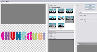
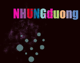
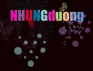
This was as simple as it gets! I like the splatter paint effect on the text. It best thing was it just took a few simple steps. I did not have some of the brushes the tutorial used which took away from the whole splattered paint effect but i tried to find other brushes that looked similar to paint. I need to find some new brushes.

2. Enhance your ad design with 3d splashes
http://psd.tutsplus.com/tutorials/photo-effects-tutorials/enhance-your-ad-designs-with-3d-splashes/


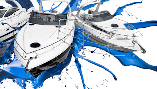
This is kind of a good idea for the image book! taking a photo of splashed paint and combining it to my image. Kind of a waste of pain though.. Maybe i use something other than paint. I like the idea of using an image of a real object, the the boat and paint in this case, to create a digital design.

3.Create an illustrated look from a Photograph
http://psd.tutsplus.com/tutorials/photo-effects-tutorials/create-an-illustrated-look-from-a-photograph/


This looks awesome! I love reading tutorial about turning real photographs to cartoons. This wasn't exactly cartoonish but computerize it. I like the paint effect. This tutorial was fairly simple. The pen tool does amazing things. no wonder they say that the pen tool is your best friend. haha. true true.

4. Create Stylish Retro Text Effect
http://psd.tutsplus.com/tutorials/text-effects-tutorials/how-to-quickly-create-a-stylish-retro-text-effect/

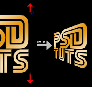
The lighting on the text looks really cool! What i liked most was the video haha. A new thing i learned from this tutorial is character. You can change the position of the each letter. that is how they got the ST to touch on PST. There are many things that havea lready been done before but creating your own thing can be done by changing little details.

5. The Brush Tool 101
http://tutvid.com/tutorials/photoshop/tutorials/brushesInPhotoshop.php

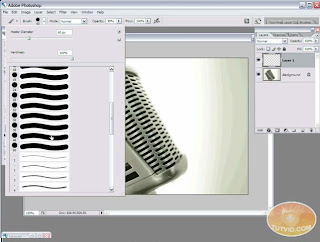
The brush tool is probably the most underestimated tool in photoshop. It seems too easy people dont even think about it. I learned about the brush hardness, opacity flow, air brush, creating a shape and picture brush and chaning the shape dimantic. The air brush does not seem useful thought.. This tuturial was 100 percent helpful. I newed a bunch of new things about the brush tool. it does a lot more than i thought.

Monday, May 18, 2009

Photo Hunt!


Sunglasses are awesome!

Coca Cola!

I just loveee flowers. =]


Sharpies looks cool. i tried two different arrangements.

I like the roses, but they might be too much little details

These are a few things i was considering to choose for my photo project. I took all the photos. I have more than 3 and don't know which one works. My favorite one is the cassette.